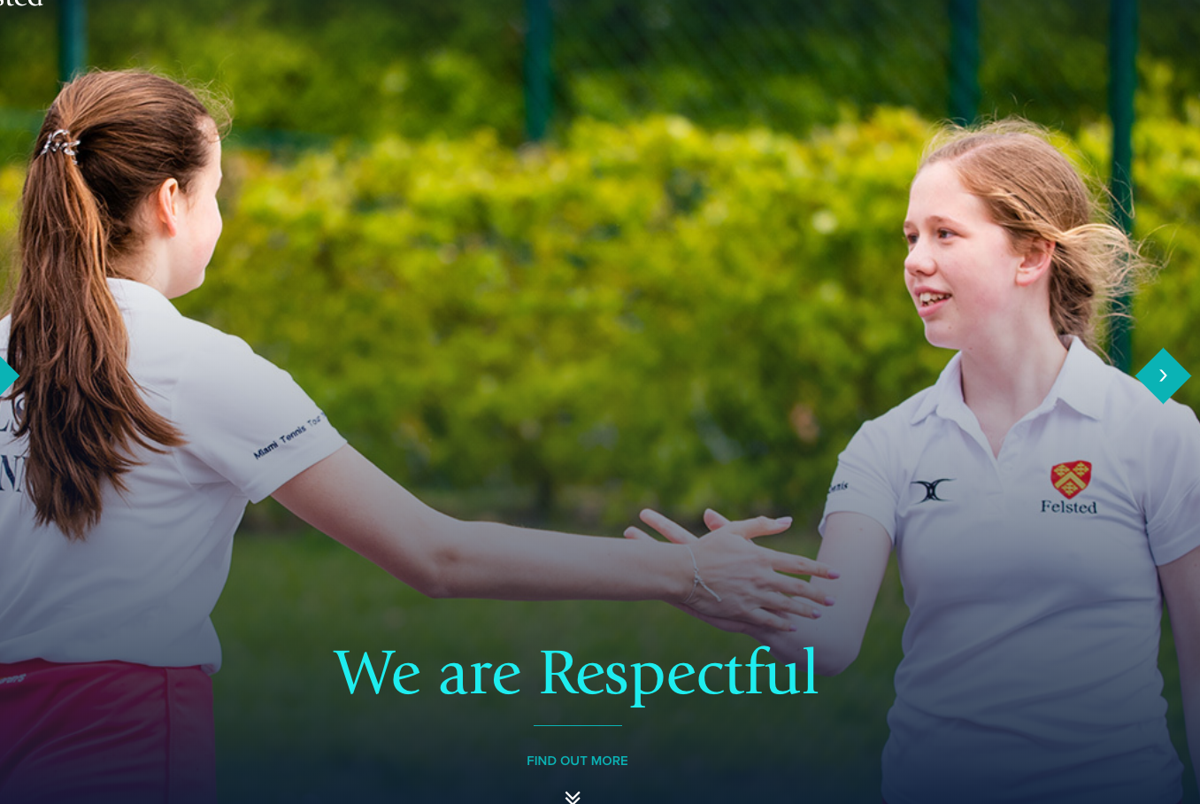
Now that the kids have finally gone back to school and they can be taught by professionals, instead of my bungling attempts at home schooling, I have finally been able to settle down to work.
One of the main areas of my job is shooting marketing photos for independent schools. The kind of photos that feature on websites, prospectuses and social media. It’s a part of the job that I love for two reasons: firstly, most kids tend to smile easily. Younger kids just smile because, well, life is fun! With older kids its more of an embarrassed smile because of having their photo taken in front of their friends. Either way, it makes for some great results; secondly because of the variety of photos I take in a school - sport, classrooms, theatre, music, portraits - all require slightly different skills which I have developed over the years and I think I can safely say, without hopefully sounds too arrogant, that I do them all very well.
This week I have been sending out a small brochure of my school photography to Marketing teams at schools. It requires a bit of research to find the right person, address etc, but the process has been interesting because I have visited a lot of school websites. It’s fascinating to see the variety of styles as well as the huge difference in the quality of photography. I can notice pretty quickly if schools have used a professional photographer and it’s been very useful to see the work of some other good photographers. More often than not though, the photos on school websites are not very strong. School website designs these days are very reliant on photos. The photos are large and dominate the page which is great. But it’s a bit depressing to see so many out of focus, flat, dull, underexposed, unsharp, poorly composed photos being used.
Now of course you might think I’m being cynical because I am touting for business! Well I am touting for business, but I am also being truthful. There are a lot of substandard images out there!
Of course, as a photographer, I am bound to notice weak photos and you might argue that most people who visit the site won’t notice if a photo is slightly out of focus. Well, I believe that even if they don’t notice it consciously, I am sure their subconscious will pick up on the webpage being not quite right. Secondly, I am certain that they would notice immediately if that page had an incredibly strong photo - they would stop and look and be impressed, lingering on the page for longer and their opinion of the school would improve.
If you’re going to go to the expense of employing a marketing team and developing a really funky website, it seems crazy not to spend a few hundred pounds more to get some really decent photos as well. These photos can then be used across all your marketing platforms both digital and physical. Despite the rise of smart phone photography there is still a place for true professionals who can deliver eye-catching imagery consistently and under time pressure. Hopefully plenty of schools will receive my little brochure and agree!
https://www.tomsoperphotography.com/#/education/


